

 Set up docs MCP
ClickStack supports visualizations based on raw SQL queries. This gives you full control over the query logic while still integrating with dashboard-level time ranges, filters, and chart rendering.
SQL-based visualizations are useful when you need to go beyond the built-in Chart Explorer — for example, to join tables or build complex aggregations that are not supported by the chart builder.
Creating a SQL-based visualization
To create a SQL-based visualization, open a dashboard tile editor and select the SQL tab.
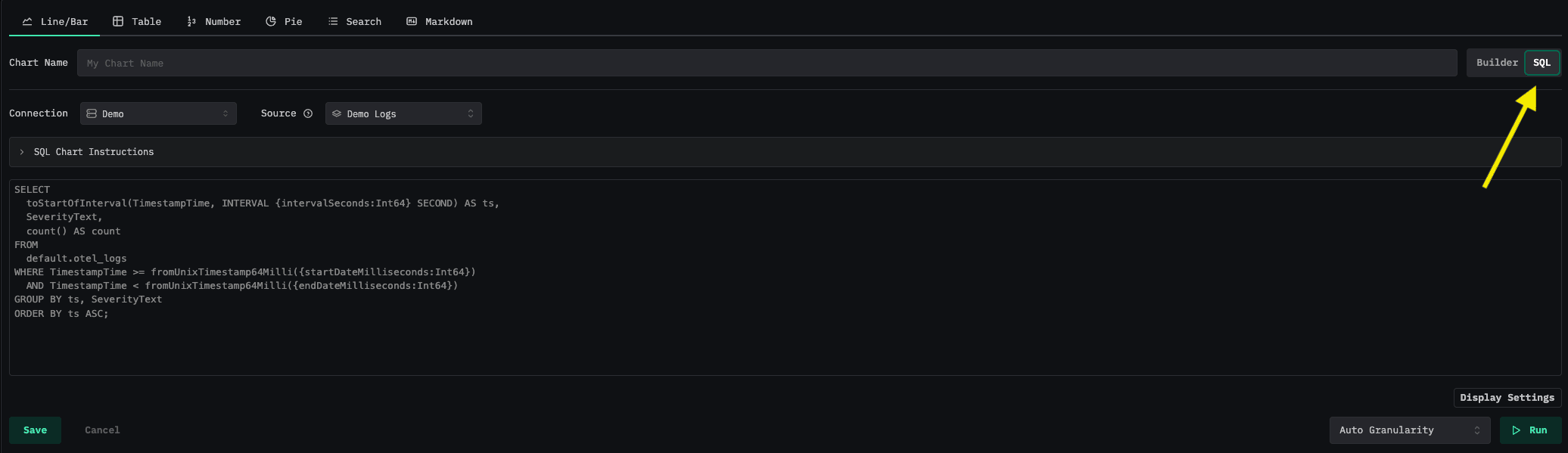
From there:
- Select a ClickHouse connection to run the query against.
- Optionally select a Source — this enables dashboard-level filters to be applied to your chart via the
$__filtersmacro. - Write your SQL query in the editor, using query parameters and macros to integrate with the dashboard time range, filters, and variables.
- Click the play button to preview results, then Save.
Query parameters
Query parameters allow your SQL to reference the dashboard’s current time range and granularity. They use the ClickHouse parameterized query syntax: {paramName:Type}.
Available parameters
The parameters available depend on the chart type:
Line and Stacked Bar charts:
| Parameter | Type | Description |
|---|---|---|
{startDateMilliseconds:Int64} |
Int64 | Start of the dashboard date range (milliseconds since epoch) |
{endDateMilliseconds:Int64} |
Int64 | End of the dashboard date range (milliseconds since epoch) |
{intervalSeconds:Int64} |
Int64 | Time bucket size in seconds (based on granularity) |
{intervalMilliseconds:Int64} |
Int64 | Time bucket size in milliseconds (based on granularity) |
Table, Pie, and Number charts:
| Parameter | Type | Description |
|---|---|---|
{startDateMilliseconds:Int64} |
Int64 | Start of the dashboard date range (milliseconds since epoch) |
{endDateMilliseconds:Int64} |
Int64 | End of the dashboard date range (milliseconds since epoch) |
Macros
Macros are shortcuts that expand into common ClickHouse SQL expressions. They are prefixed with $__ and are replaced before the query is sent to ClickHouse.
Time boundary macros
These macros return a ClickHouse expression representing the dashboard’s start or end time. They take no arguments.
| Macro | Expands to | Column type |
|---|---|---|
$__fromTime |
toDateTime(fromUnixTimestamp64Milli({startDateMilliseconds:Int64})) |
DateTime |
$__toTime |
toDateTime(fromUnixTimestamp64Milli({endDateMilliseconds:Int64})) |
DateTime |
$__fromTime_ms |
fromUnixTimestamp64Milli({startDateMilliseconds:Int64}) |
DateTime64 |
$__toTime_ms |
fromUnixTimestamp64Milli({endDateMilliseconds:Int64}) |
DateTime64 |
$__interval_s |
{intervalSeconds:Int64} |
Int64 |
Time filter macros
These macros generate a WHERE clause fragment that filters a column to the dashboard time range.
| Macro | Description |
|---|---|
$__timeFilter(column) |
Filters a DateTime column to the dashboard range |
$__timeFilter_ms(column) |
Filters a DateTime64 (millisecond) column to the dashboard range |
$__dateFilter(column) |
Filters a Date column to the dashboard range |
$__dateTimeFilter(dateCol, timeCol) |
Filters using separate Date and DateTime columns |
$__dt(dateCol, timeCol) |
Alias for $__dateTimeFilter |
Example expansion of $__timeFilter(TimestampTime):
TimestampTime >= toDateTime(fromUnixTimestamp64Milli({startDateMilliseconds:Int64}))
AND TimestampTime <= toDateTime(fromUnixTimestamp64Milli({endDateMilliseconds:Int64}))
Time interval macros
These macros bucket a timestamp column into intervals matching the dashboard granularity. They are typically used in SELECT and GROUP BY clauses for time series charts. These are only available for Line and Stacked-bar visualizations.
| Macro | Description |
|---|---|
$__timeInterval(column) |
Buckets a DateTime column into intervals of intervalSeconds |
$__timeInterval_ms(column) |
Buckets a DateTime64 column into intervals of intervalMilliseconds |
Example expansion of $__timeInterval(TimestampTime):
toStartOfInterval(toDateTime(TimestampTime), INTERVAL {intervalSeconds:Int64} second)Dashboard filter macro
| Macro | Description |
|---|---|
$__filters |
Replaced with the dashboard-level filter conditions (requires a Source to be selected) |
When a Source is selected on the chart and dashboard filters are active, $__filters expands to the corresponding SQL WHERE conditions. When no source is selected or no filters are applied, it expands to (1=1), so it is always safe to include in a WHERE clause.
Only filters with Broadcast filter condition enabled are applied by $__filters. Filters exposed as variables are referenced explicitly, as described below.
Dashboard variable macros
When a dashboard filter is available as a variable, its selected values can be referenced anywhere in the query. These macros are only available on tiles belonging to a dashboard that declares at least one variable.
| Macro | Description |
|---|---|
$__filter($<variable>) |
Expands to toString(<filter expression>) IN ($variable) when values are selected for variable, and 1=1 otherwise. |
$__filter(<expression>, $<variable>) |
Expands to <expression> IN ($variable) when values are selected for variable, and 1=1 otherwise. |
$__conditionalAll(<condition>, $<variable>) |
Expands to <condition> when the variable has a selection, 1=1 otherwise. |
A variable’s values can also be interpolated directly as $name or ${name}, with an optional format — ${name:sqlstring} (the default), ${name:csv}, or ${name:regex}. In the default format a direct reference renders as NULL before anything is selected, so prefer the macros above wherever a predicate is expected.
How query results are plotted
ClickStack automatically maps result columns to chart elements based on column types. The mapping rules differ by chart type.
Line and Stacked Bar charts
| Role | Column type | Description |
|---|---|---|
| Timestamp | First Date or DateTime column |
Used as the x-axis. |
| Series Value | All numeric columns | Each numeric column is plotted as a separate series. These are typically aggregate values. |
| Group Names | String, Map, or Array columns | Optional. Rows with different group values are plotted as separate series. |
Pie chart
| Role | Column type | Description |
|---|---|---|
| Slice Value | First numeric column | Determines each slice’s size. |
| Slice Label | String, Map, or Array columns | Optional. Each unique value becomes a slice label. |
Number chart
| Role | Column type | Description |
|---|---|---|
| Number | First numeric column | The value from the first row of the first numeric column is displayed. |
Table chart
All result columns are displayed directly as table columns.
Examples
Line chart — log count over time by service
This query counts log events per service, bucketed into time intervals matching the dashboard granularity.
SELECT
  toStartOfInterval(TimestampTime, INTERVAL {intervalSeconds:Int64} second) AS ts,
  ServiceName,
  count() AS count
FROM otel_logs
WHERE TimestampTime >= fromUnixTimestamp64Milli({startDateMilliseconds:Int64})
  AND TimestampTime < fromUnixTimestamp64Milli({endDateMilliseconds:Int64})
  AND $__filters
GROUP BY ServiceName, ts
ORDER BY ts ASCts(DateTime) is used as the x-axis timestamp.count(numeric) is plotted as the series value.ServiceName(string) creates a separate line per service.
Line chart — using macros
The same query written using macros for brevity:
SELECT
  $__timeInterval(TimestampTime) AS ts,
  ServiceName,
  count() AS count
FROM otel_logs
WHERE $__timeFilter(TimestampTime)
  AND $__filters
GROUP BY ServiceName, ts
ORDER BY ts ASC
Line chart — using dashboard variables
Given a dashboard with a service variable on ServiceName and a severity variable on SeverityText, this query scopes the chart to the current service selection and excludes the selected severities. Both macros expand to 1=1 while their variable has no selection, so the chart renders unfiltered until the viewer picks a value.
SELECT
  $__timeInterval(TimestampTime) AS ts,
  count() AS count
FROM otel_logs
WHERE $__timeFilter(TimestampTime)
  AND $__filter(ServiceName, $service)
  AND $__conditionalAll(SeverityText NOT IN ($severity), $severity)
GROUP BY ts
ORDER BY ts ASC
Stacked bar chart — error count by severity
SELECT
  $__timeInterval(TimestampTime) AS ts,
  lower(SeverityText),
  count() AS count
FROM otel_logs
WHERE $__timeFilter(TimestampTime)
  AND lower(SeverityText) IN ('error', 'warn')
  AND $__filters
GROUP BY SeverityText, ts
ORDER BY ts ASC
Table chart — top 10 slowest endpoints
SELECT
  SpanName AS endpoint,
  avg(Duration) / 1000 AS avg_duration_ms,
  count() AS request_count
FROM otel_traces
WHERE $__timeFilter(Timestamp)
  AND $__filters
GROUP BY SpanName
ORDER BY avg_duration_ms DESC
LIMIT 10
Pie chart — request distribution by service
SELECT
  ServiceName,
  count() AS request_count
FROM otel_traces
WHERE $__timeFilter(Timestamp)
  AND $__filters
GROUP BY ServiceNamerequest_count(numeric) determines each slice’s size.ServiceName(string) labels each slice.
Number chart — total error count
SELECT
  count() AS total_errors
FROM otel_logs
WHERE $__timeFilter(TimestampTime)
  AND SeverityText = 'error'
  AND $__filters
The single numeric value total_errors from the first row is displayed.
Notes
- SQL-based visualizations execute with
readonlymode enabled — onlySELECTqueries are permitted. - SQL-based visualizations must be exactly one SQL query - multiple queries are not supported.
- The SQL editor provides autocomplete suggestions for both query parameters and macros.
- A source must be selected to apply dashboard filters to SQL-based visualizations. The source should match the table being queried, for accurate filtering.
- Dashboard variables need no source — the values come from the dashboard’s filter dropdowns, not from the tile’s own source.
- Alerts on a SQL tile that references a dashboard variable evaluate with every variable in its empty state, not the values selected on the dashboard.